
Back on the painting wagon
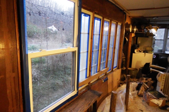
The trouble with painting
two walls in vibrant colors is that the spruce-up makes
the remaining wall look pretty terrible. This is especially true if the
final wall was your very first building project with $0 budget and
involved cobbling together odds and ends of found materials in order to
close in the gaping hole in the side of your new home before winter
hits.
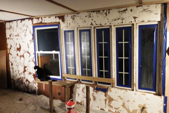
I'm generally oblivious
to clutter and interior ugliness, but I'm pretty sure Mark cringed
every time he walked into the room. Time to add
some texture to cover up the paneling and slap on a few coats of
paint!
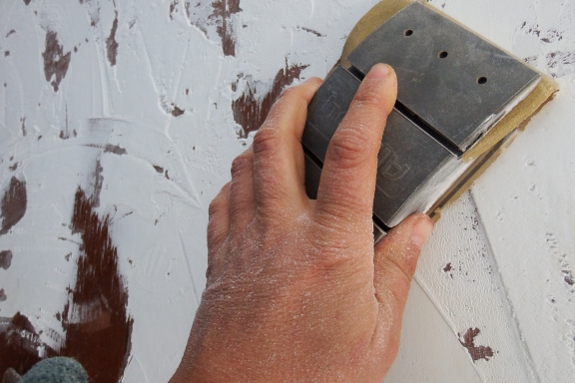
The copious windows on
this wall made me feel like the surrounding area shouldn't be quite so
lumpy and bumpy. So once the joint compound dried, I sanded lightly to
bring the texture down to a dull roar. (I still kept some texture to
maintain the theme I have going in the space.)
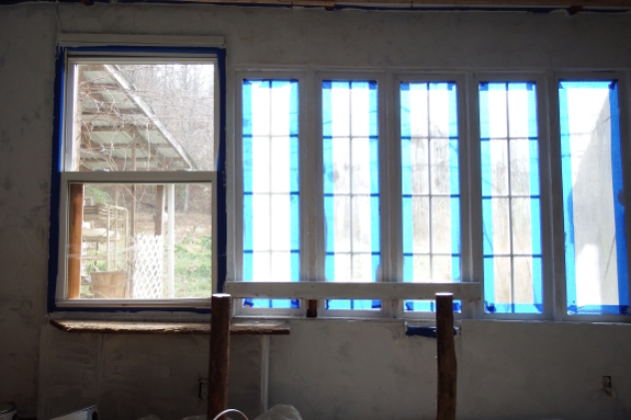
Here's the area after
the first round of primer.
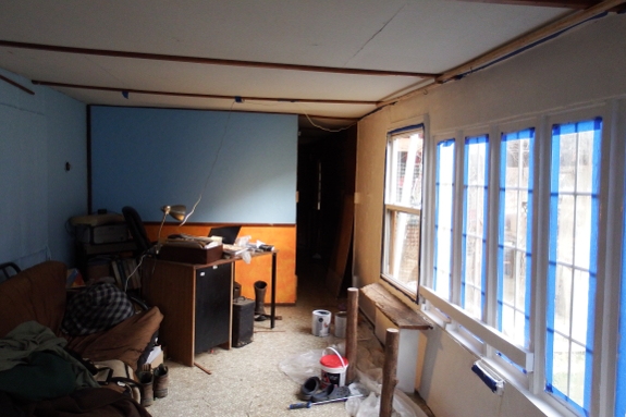
And after primer round
two. Now for color! Mark thinks we should go with the same light blue
that's on the opposite wall. What do you think?
Want more in-depth information? Browse through our books.
Or explore more posts by date or by subject.
About us: Anna Hess and Mark Hamilton spent over a decade living self-sufficiently in the mountains of Virginia before moving north to start over from scratch in the foothills of Ohio. They've experimented with permaculture, no-till gardening, trailersteading, home-based microbusinesses and much more, writing about their adventures in both blogs and books.
Want to be notified when new comments are posted on this page? Click on the RSS button after you add a comment to subscribe to the comment feed, or simply check the box beside "email replies to me" while writing your comment.
- Remove comment
- Remove comment
- Remove comment
- Remove comment
- Remove comment
