Average weather
 Long-term
readers have probably noticed that I'm a big fan of numbers and graphs,
so you won't be surprised to hear that I peruse local climate data with
a fine-tooth comb. Back in my
wandering years, my
favorite way of getting to know a new area was making a graph of the
monthly average highs and lows and the inches of precipitation. I
generally had to dig pretty deep to find that information, then graph
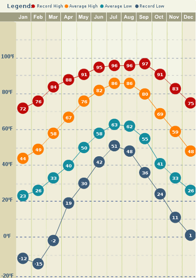
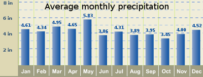
it myself, so I was thrilled to find Weather.com's
average climate feature.
The link above takes you
to information for the town where I spent a lot of my childhood which
is only about 50 miles away from where I now live. The geekiest
among you may enjoy comparing data from my hometown to data from my
current town --- if Weather.com can be trusted, my current location is
8.5 inches wetter than my hometown! Although the data says that
we're only two tenths of a degree colder here on average, I suspect
that information is less relevant to our homestead --- without any
pavement nearby, our farm's temperatures are regularly as much as five
degrees colder than the website reports for our nearest town.
 The real reason I looked up
this data, though, was to remind myself that we're on the upswing of
the year. Although just the word "February" is enough to make me
shiver, the cold hard facts say that February isn't all that cold or
hard. In fact, January is our coldest month --- maybe my boots
won't be freezing to the floor any more in a few weeks.
Want more in-depth information? Browse through our books.
Or explore more posts by date or by subject.
About us: Anna Hess and Mark Hamilton spent over a decade living self-sufficiently in the mountains of Virginia before moving north to start over from scratch in the foothills of Ohio. They've experimented with permaculture, no-till gardening, trailersteading, home-based microbusinesses and much more, writing about their adventures in both blogs and books.
Want to be notified when new comments are posted on this page? Click on the RSS button after you add a comment to subscribe to the comment feed, or simply check the box beside "email replies to me" while writing your comment.
- Remove comment

- Remove comment
